Use the react-blessed-contrib Grid component to make a dashboard layout
September 29, 2020
This is the 10th post in a series where we will be creating a developer dashboard in the terminal using react-blessed and react-blessed-contrib. For more information about the series and to take a sneak peak at what we're building, go to the 1st post in the series for more context.
- Bootstrap
react-blessedApplication - Add ESLint Rules to
react-blessedApp - Change text font with
figlet - Extract Component and Add
useIntervalhook - Fetch and display current weather with
weather-js - Extract custom hook to simplify data fetching
- Change text color with
chalkandgradient-string - Position and Align Text inside a
<box>Element - Make a Percentage Based Layout
- Layout Dashboard with
react-blessed-contribGrid
NOTE: You can find the code for this project in GitHub and you watch the whole Build a Terminal Dashboard with React video series on egghead.io.
Current Application
Here we have the beginnings of a React Terminal Dashboard. At this point, we have sections laid out on the terminal for Today, Recent Commits, Time Log, Pomodoro, and GitHub.
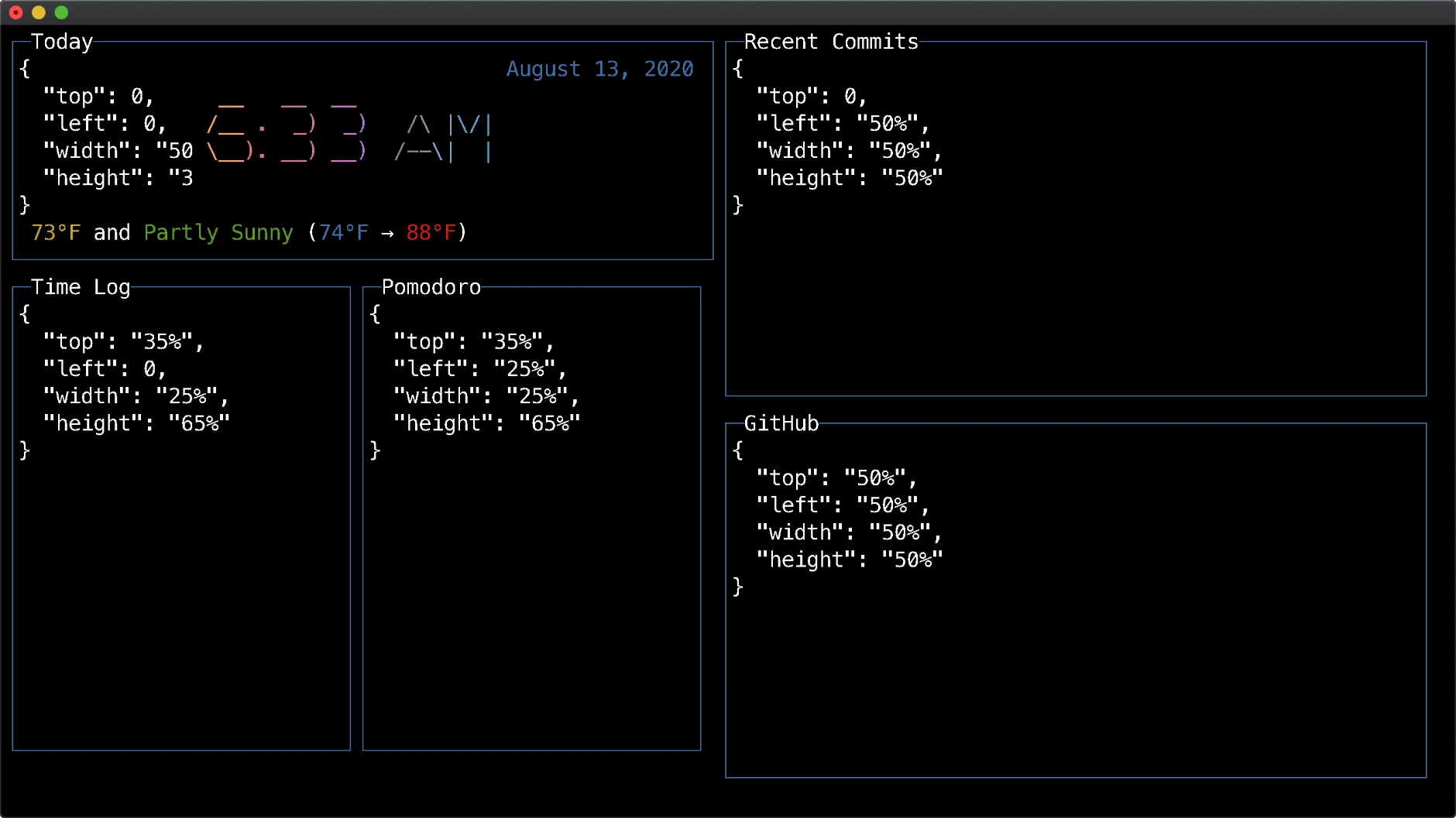
These components are currently laid out manually with percents. To fully take up the space we need to divide out 100%. For example, horizontally since Today has a width of 50%, then Recent Commits needs to be 50%, and likewise the bottom 3 components need to add up to 100% (25%, 25%, and 50%);
import React, { Fragment } from 'react'
import blessed from 'blessed'
import Today from './components/Today'
import Box from './components/Box'

const App = () => {
  return (
    <Fragment>
      <Today updateInterval={900000}
        top={0} left={0} height="35%" width="50%" />
      <Box label="Time Log"
        top="35%" left={0} height="65%" width="25%" />
      <Box label="Pomodoro"
        top="35%" left="25%" height="65%" width="25%" />
      <Box label="Recent Commits"
        top={0} left="50%" height="50%" width="50%" />
      <Box label="GitHub"
        top="50%" left="50%" height="50%" width="50%" />
    </Fragment>
  )
}
<Grid> Component
Instead of laying out our components using percentages, we are going to reach for another repo called react-blessed-contrib, which is a set of contrib widgets (React components) that can be rendered with react-blessed and is a wrapper around the underlying blessed-contrib codebase. The blessed-contrib repo has lots of helper widgets such as line chart, bar chart, map, guage, donute, sparkline, etc... but the item we'll be using is the <Grid> layout.
Install react-blessed-contrib
We'll install the contrib depedency with npm using the following command...
npm install react-blessed-contrib
Use <Grid> and Update Props
Now, we'll import Grid from react-blessed-contrib and then replace Fragment with Grid defining 12 rows and columns. This declares how many rectangles will be in our 12 x 12 grid. Then we'll go through and replace top, left, width, and height props to row, col, colSpan, and rowSpan.
import React from 'react'
import blessed from 'blessed'
import Today from './components/Today'
import Box from './components/Box'
import { Grid } from 'react-blessed-contrib'

const App = () => {
  return (
    <Grid rows={12} cols={12}>
      <Today updateInterval={900000}
        row={0} col={0} rowSpan={4} colSpan={6} />
      <Box label="Time Log"
        row={4} col={0} rowSpan={8} colSpan={3} />
      <Box label="Pomodoro"
        row={4} col={3} rowSpan={8} colSpan={3} />
      <Box label="Recent Commits"
        row={0} col={6} rowSpan={6} colSpan={6} />
      <Box label="GitHub"
        row={6} col={6} rowSpan={6} colSpan={6} />
    </Grid>
  )
}
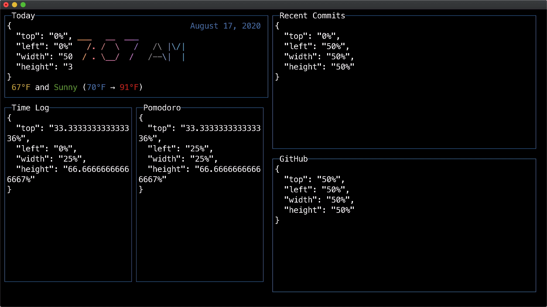
The end result looks much similar to the previous precentage-based layout, but this one is a bit simplier to think about. It's up to you how you prefer to layout your dashboard, but I particular enjoy using the <Grid>, so for the rest of this series we will keep this approach.
Conclusion
There are many ways to define a dashboard layout. We could have hard-coded values, used percentages, or leverage the <Grid> component. Depending on your needs you may decided to use one or another or even combined a few of them together. Going forward we will start building out some of those other components, so stay tuned!
Tweet about this post and have it show up here!