Make a Percentage Based Layout in react-blessed
September 10, 2020
This is the 9th post in a series where we will be creating a developer dashboard in the terminal using react-blessed and react-blessed-contrib. For more information about the series and to take a sneak peak at what we're building, go to the 1st post in the series for more context.
- Bootstrap
react-blessedApplication - Add ESLint Rules to
react-blessedApp - Change text font with
figlet - Extract Component and Add
useIntervalhook - Fetch and display current weather with
weather-js - Extract custom hook to simplify data fetching
- Change text color with
chalkandgradient-string - Position and Align Text inside a
<box>Element - Make a Percentage Based Layout
- Layout Dashboard with
react-blessed-contribGrid
NOTE: You can find the code for this project in GitHub and you watch the whole Build a Terminal Dashboard with React video series on egghead.io.
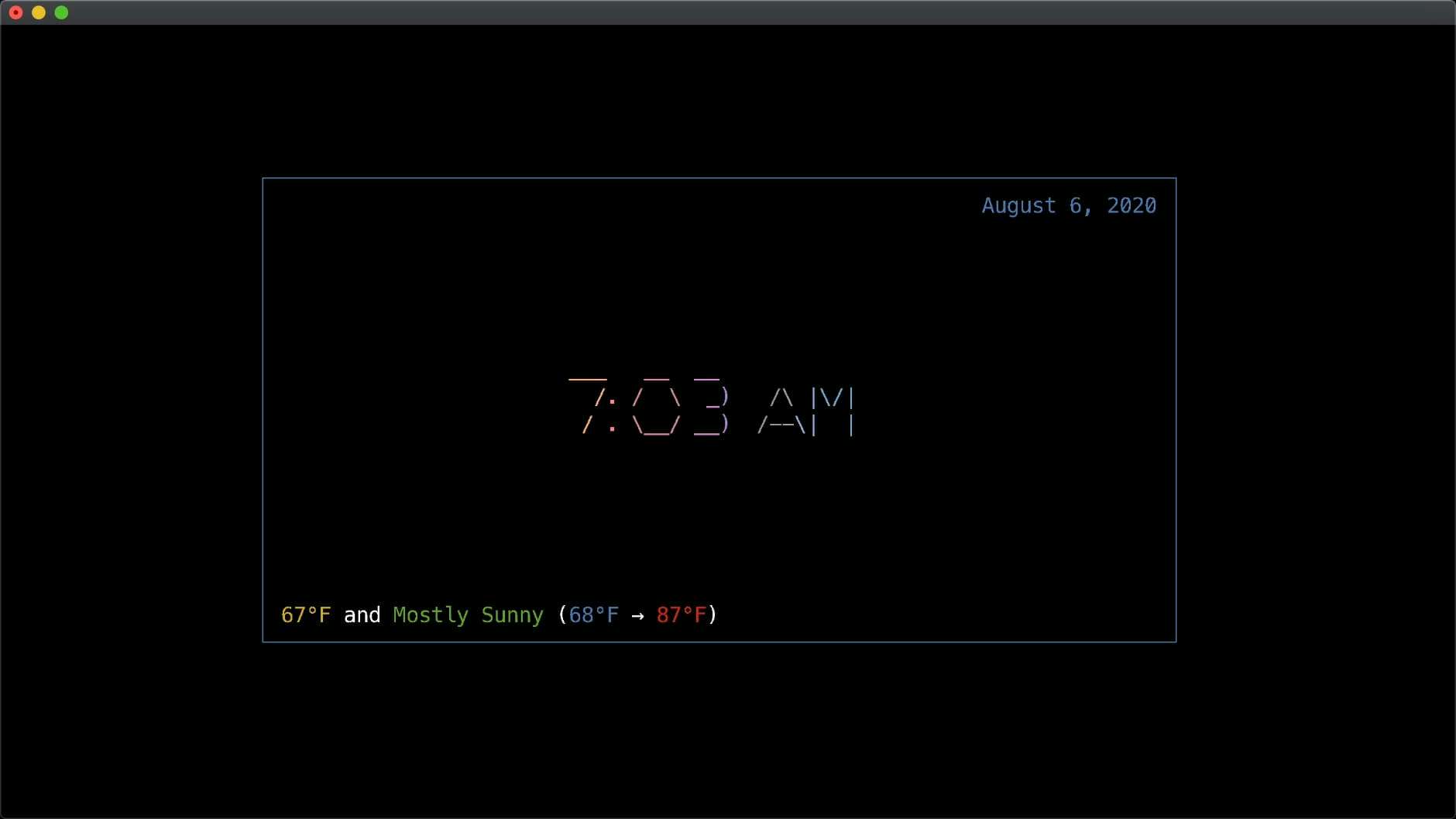
Current Application
Here we have the beginnings of a React Terminal Dashboard. If we come to the terminal and kick off our app with npm start you'll see a sightly colored version displaying the date, current time and weather information.
In this post, we are going to focus on how to layout various components in the terminal, in a grid-like structure, to create the beginnings of our dashboard.
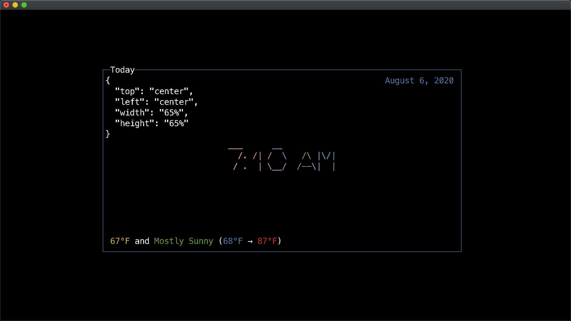
Extracting a Common <Box> Component
Up until now, we've been using the native <box> component from react-blessed and applying our own position logic and styling. Let's create an abstraction around <box> that we'll use as we stub out other components for our dashboard.
We'll accept the props label, top, left, width, height, and children and spread those onto the underlying <box> component along with some basic styling. Then inside we'll print out a JSON stringifyed version of the positions and then do a little formatting with null and 2 spaces. And we'll render the children as well.
import React from 'react'

export default function Box({ label, top, left, width, height, children }) {
  const boxProps = { label, top, left, width, height }

  return (
    <box
      {...boxProps}
      border={{ type: 'line' }}
      style={{
        border: { fg: 'blue' }
      }}
    >
      {`${JSON.stringify({ top, left, width, height }, null, 2)}`}
      {children}
    </box>
  )
}
NOTE: This step was partly to extra out common logic, but is also temporarily useful to see the layout information rendered in the terminal as we focus on layout.
If we modify our existing Today component to use our new <Box> abstration and then run our app, we should see the same result, but now with the position information listed.
Laying Out Other Components
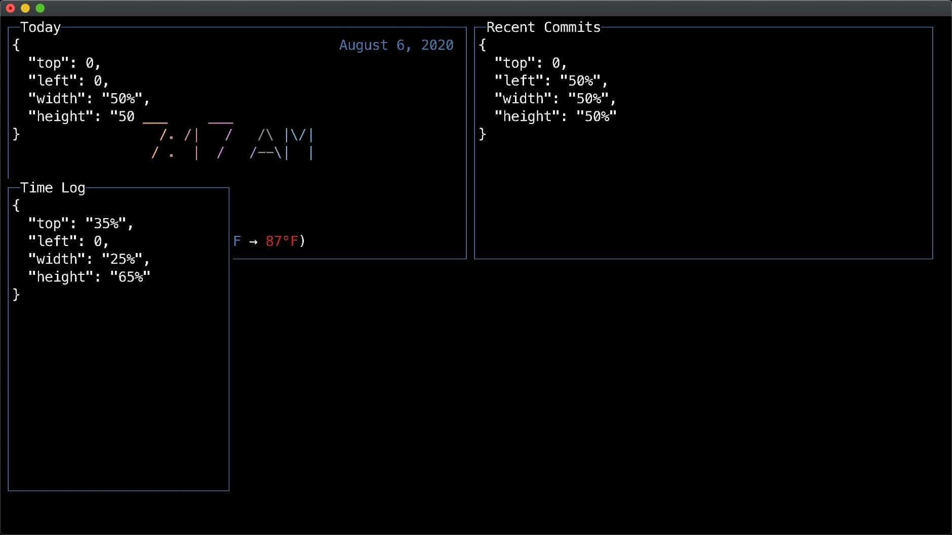
Let's focus on stubbing out some other components and laying them out in the terminal. First, we'll use a React Fragment so that we can group our components all at the same level without wrapping them and then we'll move our <Today> component inside of it.
And then we'll add a <Box> component inside the Fragment and we'll give it a label of "Recent Commits", top of 0 (to be at the top of the terminal), left of 50% (so that it's to the right of the Today component), width of 50% (so that it extends the rest of the terminal width), and height of 50% (so that it takes up half the vertical height). In addition, we'll add another stubbed item called "Time Log" and give it some positions.
const App = () => {
  return (
    <Fragment>
      <Today
        top={0}
        left={0}
        width="50%"
        height="35%"
        updateInterval={900000}
      />
      <Box
        label="Recent Commits"
        top={0}
        left="50%"
        width="50%"
        height="50%"
      ></Box>
      <Box label="Time Log" top="35%" left={0} width="25%" height="65%" ></Box>
    </Fragment>
  )
}
And now, if we run our code... ohh opps! That's not quite what we were wanting there. It looks like my percentages don't add up to 100%, which is pretty important for this type of layout. However, it's actually really good to know that you can overlay boxes like this. That concept might come in handy later in this series (hint hint).
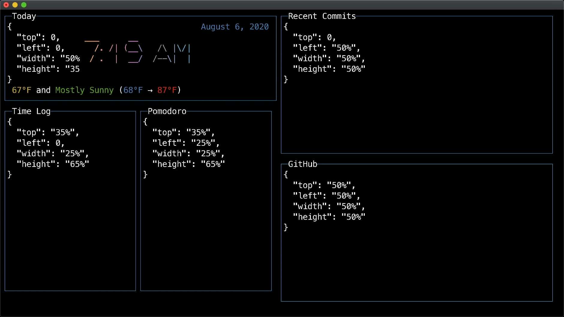
Fixing Layout & Adding Filling in the Gaps
So, let's go back and fix this issue. We'll update the height of the <Today> compoennt to 35%, which should give enough room for the Time Log. Then we'll add some other stubbed components, like "Pomodoro" and "GitHub" to fill out the rest of the dashboard.
const App = () => {
  return (
    <Fragment>
      <Today
        top={0}
        left={0}
        width="50%"
        height="35%"
        updateInterval={900000}
      />
      <Box
        label="Recent Commits"
        top={0}
        left="50%"
        width="50%"
        height="50%"
      ></Box>
      <Box label="Time Log" top="35%" left={0} width="25%" height="65%"></Box>
      <Box label="Pomodoro" top="35%" left="25%" width="25%" height="65%"></Box>
      <Box label="GitHub" top="50%" left="50%" width="50%" height="50%"></Box>
    </Fragment>
  )
}
Now, we can run our app for the last time and see that we have 5 boxes rendered in the terminal laid out with percentages to make our dashboard.
Conclusion
Although this is one way to layout components in a dashboard, in the next part of this series we will look at another way to layout component using an actual <Grid> component. You can use either approach, but for the final product I'll be using the <Grid>, so stay-tuned!
Tweet about this post and have it show up here!